TL;DR I created a graphic syllabus. The final product is cool, but it took a lot of time. I’d do it again. It was fun.
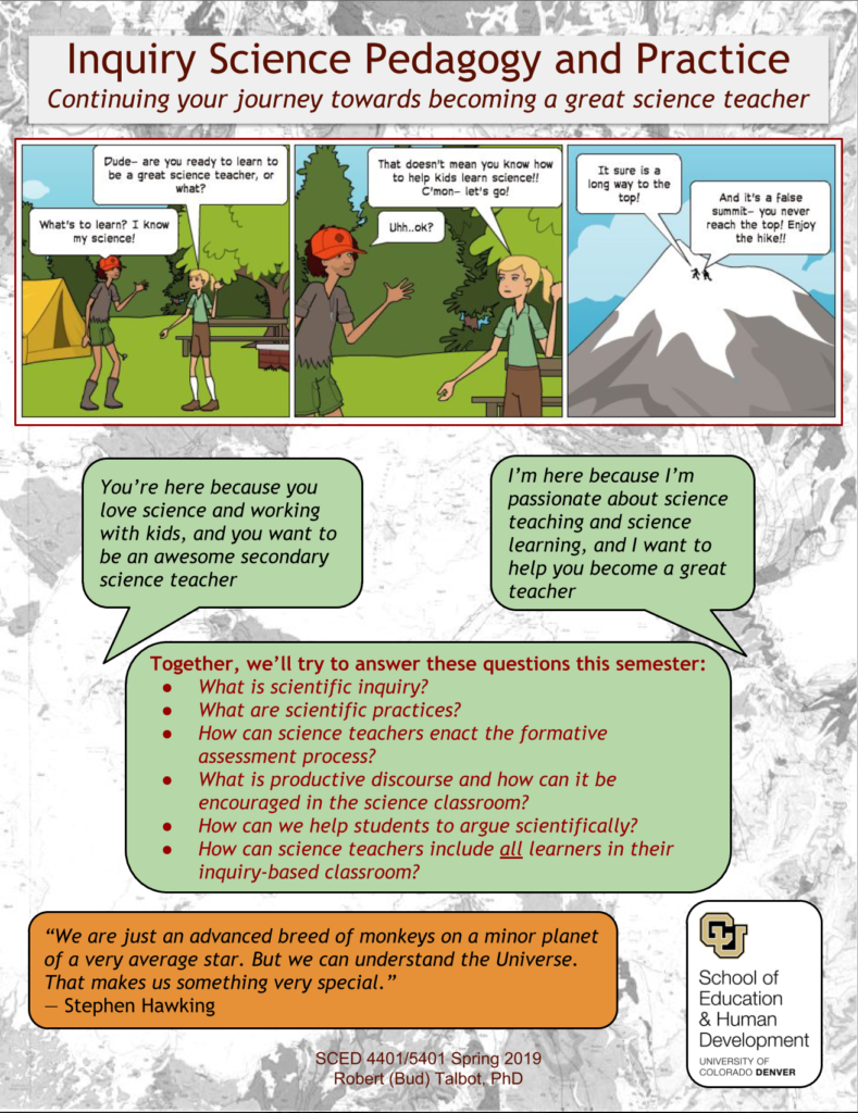
So with a new semester approaching, I decided it was time to do a better job with my course syllabus. And having been inspired by some of my colleagues, including Dr. Lindsay Hamilton (@DrLHamilton), I committed to creating a more engaging “graphic” syllabus for my Inquiry Science Pedagogy and Practice course, a secondary science methods course for pre-service teachers. .
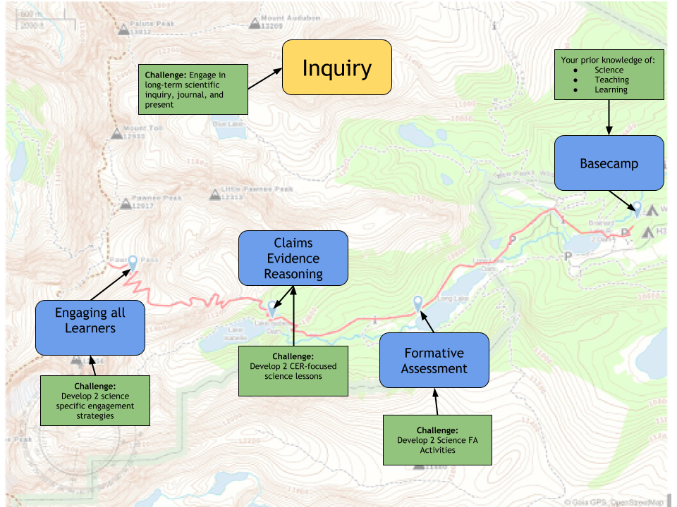
I wanted to go with a map/hike/journey analogy for the course, since I’m really into maps. So that’s where I started. I logged into my Gaia GPS account and pulled up a topographic map of one of my favorite nearby hiking areas. I created a route and marked a few waypoints, then exported the map as an image so I could edit it. SO in my mind I had this journey from Basecamp, through the Formative Assessment, Claims-Evidence-Reasoning, and Engaging all Learners waypoints along the hike. And overarching it all was this theme on Inquiry.

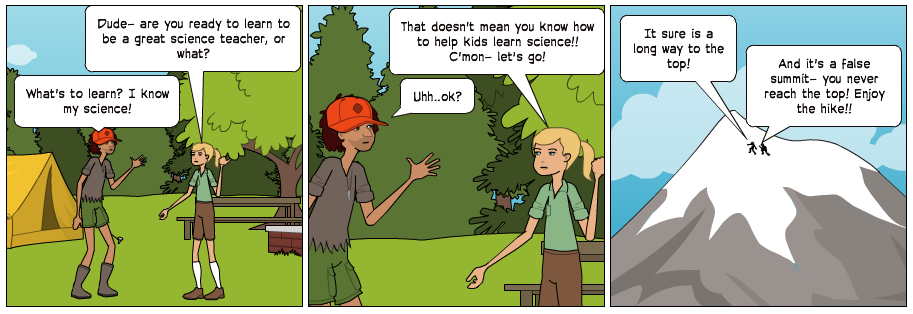
After creating the map graphic and hike analogy (which is all I was going to do) I decided to make a comic strip. I Googled around for sites to help (of which there were many) but finally landed on one suggested by one of my 9 year old daughters- Pixton. My daughter helped me figure out how to make a comic strip, and even how to edit the characters’ attributes. I’m not sure if I could’ve persisted through the comic making phase of the project without her help. It’s not my forte. So I created the lead-in comic for the syllabus, which totally sent me down the design rabbit hole.

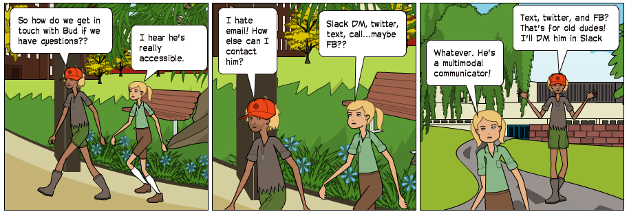
The other big design element that I worked on (after a second fun comic strip about contacting me) was the course schedule. In my traditional syllabi, this is usually a table to dates, topics, reading, and assignments. Since all of that and the details are in the Canvas course, I thought it might be better to represent this information more broadly and generally, so I created a sort of Gantt chart. I color coded when things should be worked on and when assignments are due. It is my hope that students can use this as a visual for semester long planning, then get the details from the course in Canvas.
At this point I was ready to just get the necessary content into the syllabus. Course essential questions, grading policies, contact details, etc. I chose to put these elements in text boxes throughout the document, in order to try to get away from the linear fashion of most syllabi.
Finally, I had fun inserting a few quotes, some science icons, and a fun “Science/Not Science” table. My goal here was to make the document something that students would want to read, not something they had to read.
Overall, I think it’s a good first take on a “reformed” graphic syllabus. It certainly took a lot of time, but mostly because I don’t have a lot of design skill or experience. But it was fun. I am definitely planning on doing this for my other courses in the future. Now, I’m anxious to get some student feedback. Here’s a link to the final product. Thanks for reading.


This work is licensed under a Creative Commons Attribution-NonCommercial-ShareAlike 4.0 International License.

